_imgupscaler.ai_Sharpen_2K")
A couple of months ago I was busy preparing pieces to exhibit at our NEOS show. I had recently finished work on a flock of siskins – those little brightly coloured birds which we have in abundance here in the Scottish Highlands. I chose a simple light green background to stitch them out on, but when I saw the result I wasn’t happy. These little birds are always scurrying around in the middle of leafy trees and bushes, and the stitchout just looked too plain and bare to me
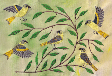
Simple siskins
So I painted a background that reflected more accurately the leafy background that you see where they usually live, and tried again
Well, it was certainly a more realistic background, but again I wasn’t happy. Was it maybe too “busy”? Could you see the little birds clearly enough?
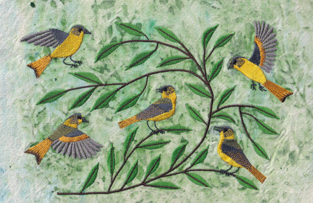 Complicated siskins
In the end I chose the second “busy” version to frame and exhibit, and it was sold, but I’m still not sure which was the best. And I’m still brooding about it!
I won’t be posting for a while now as we’re going down to Edinburgh for a short break, but I”ll be back later in the month
Hi Mia, I think both versions are lovely. As in any form of artwork however, some will prefer one version while others will prefer another. Have a great and relaxing weekend!
I like the second version, it gives it more motion I think like the birds creating motion coming and going. I don’t think it has to be realistic, just the feeling of how they are busy.
Have a good vacation, but take notes should you see something worthy.
Linda
Both versions are delightful! I’ve had this dilemma before and I just had to step away for a while. Then I had “new eyes” when I came back to it.
Have a lovely time away!
I wonder if it’s a contrast issue? The first thing my eye sees in the first stitchout is the green of the leaves. Maybe the color of the birds is too close to the background color in tone and value? The color of the birds is more obvious in the 2nd stitchout, but as you say, it’s a little busy, possibly because of the dotted effect of the fabric painting.
I wonder if you go back to the first strategy, but choose a different color background, blue for water behind it or darker for pre-dawn forest, etc.?
I love both wersions
Enjoy you vacation